


The Transformative Canvas: Mastering Living Room Wall Paint for Interior Design
The living room, often the heart of the home, is where life unfolds – from quiet evenings with a book to lively gatherings with loved ones. It’s the space that sets the tone for your entire home, and arguably, no single design element has a more immediate and profound impact on its atmosphere than the color of its walls. More than just a backdrop, paint is a powerful design tool, capable of altering perceptions of space, light, and mood, reflecting personality, and unifying disparate elements within a room.
Embarking on a living room paint project is an exciting journey that moves beyond simply picking a pretty shade. It’s an exercise in understanding color psychology, assessing your unique space, and mastering the practicalities of application. This comprehensive guide will delve into the nuanced world of interior design painting for living rooms, helping you unlock its full potential to create a space that is not only beautiful but truly feels like home.
I. The Psychology of Color: Setting the Mood

Before even considering a single swatch, it’s vital to grasp the emotional and psychological effects of different colors. Each hue carries an inherent energy that can subtly or dramatically influence how a room feels.
- Warm Colors (Reds, Oranges, Yellows): These colors evoke energy, warmth, and intimacy. They can make large spaces feel cozier and more inviting, stimulating conversation and activity. However, too much intensity can feel overwhelming or even claustrophobic in smaller rooms.
- Cool Colors (Blues, Greens, Purples): Associated with calmness, serenity, and spaciousness, cool tones are excellent for creating a tranquil retreat. They tend to recede visually, making a room appear larger and more open. Blues can be deeply relaxing, greens connect us to nature, and purples can add a touch of sophistication or whimsy.
- Neutrals (Grays, Whites, Beiges, Greiges): The backbone of many design schemes, neutrals offer versatility and timelessness. They provide a calm foundation, allowing furniture, art, and accessories to shine. While often perceived as safe, the right neutral can be incredibly sophisticated, creating a serene, minimalist, or even luxurious ambiance.
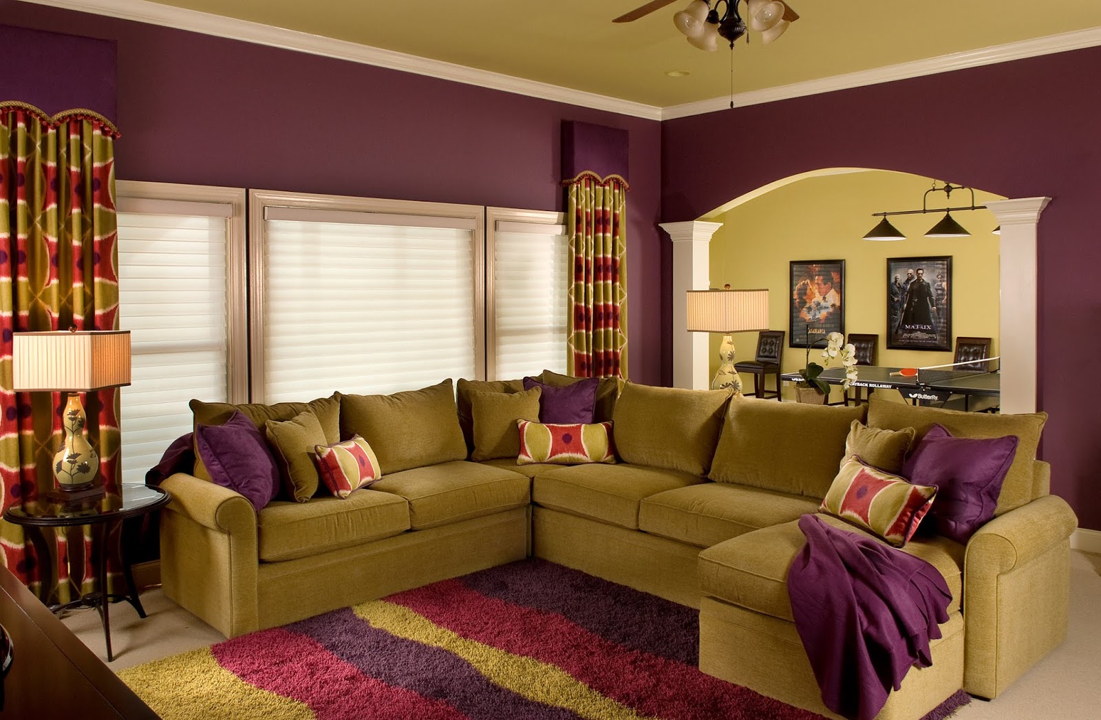
- Deep & Saturated Tones (Charcoal, Navy, Forest Green, Jewel Tones): These colors make a bold statement, creating a sense of drama, intimacy, and luxury. They can envelop a room, making it feel cozy and sophisticated, particularly in spaces with ample natural light or high ceilings.

II. Pre-Paint Considerations: The Foundation of Success
The most beautiful paint color can fall flat if not chosen with careful consideration of the existing environment.
A. Assessing Your Space
- Natural Light: This is perhaps the most critical factor.
- North-facing rooms: Tend to receive cooler, indirect light, making colors appear darker and cooler. Warm colors can counteract this, bringing warmth and cheer.
- South-facing rooms: Bathed in bright, warm light throughout the day. Almost any color will look good here, but cool colors can help balance the warmth and prevent the room from feeling too hot.
- East-facing rooms: Get bright, warm light in the morning, becoming cooler in the afternoon. Colors will shift throughout the day.
- West-facing rooms: Receive warm, often intense light in the afternoon and evening. Cool colors can provide a soothing contrast.

- Room Size and Ceiling Height:
- Small rooms: Lighter colors make a room feel larger and more open. Using the same color on walls and trim can also create a seamless, expansive feel.
- Large rooms: Can handle deeper, richer colors without feeling overwhelmed, creating a sense of intimacy and grandeur.
- Low ceilings: Painting the ceiling a lighter color than the walls, or even a very light cool color, can make it appear higher.
- High ceilings: Can be brought down visually by painting them a darker or warmer color than the walls, creating a cozier feel.

- Existing Elements: Don’t forget the unchangeable or difficult-to-change elements:

- Flooring: Hardwood, carpet, or tile all have undertones that must harmonize with your chosen paint color.
- Upholstery & Furniture: Your sofa, armchairs, and major pieces of furniture are significant color contributors.
- Art & Decor: Consider how your existing artwork and decorative items will pop or blend with the new wall color.
- Architectural Features: Fireplaces, built-in shelving, or intricate moldings can be highlighted or subtly integrated with paint.


B. The Power of Samples
Never skip this step! Paint colors look dramatically different on a small chip than they do on an entire wall. Purchase sample pots and paint large swatches (at least 2×2 feet) on several different walls in your living room. Observe them throughout the day, in varying natural and artificial light conditions. Live with them for a few days before making a final decision. This step alone can prevent costly mistakes and disappointment.
C. Sheen Selection: More Than Just Shine
Paint sheen refers to how reflective the paint finish is, ranging from flat to high-gloss. This choice significantly impacts durability, cleanability, and the overall look.
- Flat/Matte: Non-reflective, hides imperfections well, provides a sophisticated, velvety look. Ideal for low-traffic areas like living rooms, but less durable and harder to clean.
- Eggshell/Satin: Slightly more durable than flat with a soft, subtle sheen. Eggshell is often preferred for living room walls due to its balance of elegance and durability, while satin offers a bit more luster and cleanability.
- Semi-Gloss: More durable and reflective, ideal for trim, doors, and high-traffic areas where easy cleaning is essential.
- High-Gloss: Highly durable and reflective, creating a dramatic, mirror-like finish. Best reserved for accent walls, furniture, or specific architectural details due to its tendency to highlight imperfections.
III. Navigating the Color Palette: A Guide to Popular Choices
Let’s explore some perennial favorites and trending hues for living room walls:
A. Timeless Neutrals
- Whites: From crisp gallery white to soft off-whites with creamy or grayish undertones, white is never truly "just white." It creates a clean, airy, and expansive feel, serving as a perfect canvas for colorful furniture and art. Consider warm whites for a cozy feel and cool whites for a contemporary edge.
- Grays: Incredibly versatile, grays can be warm (greige) or cool (blue-gray). They offer sophistication and modernity. Lighter grays create a serene backdrop, while darker charcoals can add drama and depth.
- Beiges & Greiges: The evolution of beige, greige (a blend of gray and beige) offers a warm neutral that avoids the yellowness of traditional beige while retaining its comforting warmth. They are fantastic for creating inviting, timeless spaces.
B. Soothing Blues & Greens
- Soft Blues: Evoke tranquility and spaciousness. From sky blue to muted denim, they are perfect for creating a relaxing sanctuary.
- Deep Blues (Navy, Indigo): Offer a sophisticated, enveloping feel, creating a cozy yet dramatic atmosphere, especially when paired with warm woods and metallic accents.
- Greens: From soft sage to deep emerald, greens connect us to nature, promoting a sense of renewal and tranquility. Lighter greens can make a small room feel airy, while deeper shades like forest or moss green can create a sophisticated, enveloping library-like atmosphere, especially when paired with natural wood tones and plush textiles.
C. Warm & Inviting Hues
- Blush & Terracotta: These warm, earthy tones are gaining popularity. Blush offers a gentle, sophisticated warmth, while terracotta brings a bohemian, grounded feel, reminiscent of sun-drenched landscapes.
- Ochre & Mustard: Rich and inviting, these deep yellows add warmth and personality, working beautifully with natural textures and vintage-inspired decor.
D. Bold & Dramatic Statements
- Charcoal & Black: For the daring, these shades create immense drama and sophistication, making lighter furniture and art truly pop. Best used in rooms with ample natural light or as an accent.
- Jewel Tones (Emerald, Sapphire, Ruby): These rich, saturated colors instantly add luxury and depth, often used on accent walls or in rooms designed for a more intimate, opulent feel.
IV. Beyond a Single Hue: Creative Painting Techniques
While a single, uniform color is elegant, incorporating creative techniques can add layers of interest and personality.
- The Accent Wall: A classic choice. Painting one wall a bolder or darker color than the others draws the eye, highlights a focal point (like a fireplace or a gallery wall), and adds depth without overwhelming the room.
- Two-Tone Walls: Divide the wall horizontally (often with a chair rail) and paint the top and bottom sections different colors. This can add architectural interest, make ceilings appear higher (if the lighter color is on top), or introduce a sophisticated, layered look.
- Striped Walls: Vertical stripes can make a room feel taller, while horizontal stripes can make it feel wider. Choose subtle tone-on-tone stripes for understated elegance or contrasting colors for a more playful, dynamic effect.
- Faux Finishes & Textures: Techniques like sponging, rag rolling, or even creating a limewash effect can add tactile interest and depth. These are more advanced and often best left to professionals or experienced DIYers.
- The Ceiling as the Fifth Wall: Don’t forget the ceiling! Painting it a lighter version of your wall color, a complementary shade, or even a bold, unexpected color can dramatically alter the room’s perception, making it feel cozier or more expansive.
V. The Practicalities: Preparation and Execution
Even the most carefully chosen color will disappoint if the application is subpar. Proper preparation is paramount.
A. Essential Tools:
- Drop cloths/plastic sheeting
- Painter’s tape (high quality for crisp lines)
- Screwdriver (for removing outlet covers)
- Spackle/joint compound and putty knife
- Sanding block/paper
- Primer (especially for color changes or new drywall)
- Paint rollers (various nap sizes for different textures)
- Paintbrushes (angled for cutting in, straight for trim)
- Paint trays, stir sticks
- Clean rags, soap and water for cleanup
B. Thorough Preparation:
- Clear the Room: Remove all furniture if possible, or move it to the center and cover it. Remove all wall hangings, outlet covers, and switch plates.
- Clean the Walls: Wash walls thoroughly with a mild detergent (like TSP substitute) and water to remove dirt, grease, and grime. Rinse well and allow to dry completely.
- Repair Imperfections: Fill any holes or cracks with spackle, sand smooth, and wipe away dust.
- Tape Off: Apply painter’s tape meticulously along baseboards, door frames, window frames, and the ceiling line. Press firmly to seal edges and prevent bleeding.
- Prime: If you’re painting over a dark color with a lighter one, changing paint types (e.g., oil to latex), or painting new drywall, prime first. Primer creates a uniform surface for the paint to adhere to, ensuring true color and better coverage.
C. Application Tips:
- Cut In First: Use a brush to paint a strip (about 2-3 inches wide) around all edges, corners, and trim before rolling.
- Roll Evenly: Load your roller evenly and apply paint in "W" or "M" patterns, then fill them in with straight, overlapping strokes. Work in small sections.
- Two Coats are Key: Most colors require at least two coats for full coverage and true color. Allow adequate drying time between coats as per manufacturer instructions.
- Remove Tape: Remove painter’s tape while the final coat is still slightly wet (but not tacky) for the cleanest lines.
VI. Avoiding Common Pitfalls
- Rushing Preparation: The most common mistake. Skipping cleaning, patching, or taping leads to a messy, unprofessional finish.
- Ignoring Samples: Relying on tiny paint chips is a recipe for disappointment.
- Choosing the Wrong Sheen: Flat paint in a high-traffic area will quickly show scuffs.
- Poor Ventilation: Paint fumes can be strong. Ensure good airflow with open windows and fans.
- Not Stirring Paint: Pigments can settle, leading to inconsistent color. Always stir thoroughly.
- Underestimating Paint Quantity: Use an online calculator or consult with paint store staff to ensure you buy enough. It’s better to have a little extra for touch-ups.
VII. The Finishing Touches: Beyond the Paint Can
Once the paint is dry and the room is reassembled, the new wall color provides the perfect backdrop for your living room’s personality to shine. Reintroduce your furniture, layer in textiles like rugs, throws, and pillows that complement or contrast with the new walls. Add artwork, mirrors, and lighting fixtures that enhance the mood. Plants bring life and freshness, completing the aesthetic.
Conclusion
Painting your living room walls is far more than a simple home improvement project; it’s a profound act of interior design that can utterly transform your space. By understanding the psychology of color, meticulously preparing your canvas, selecting the right hues and techniques, and executing with care, you can create a living room that not only looks stunning but also feels deeply personal and inviting. Embrace the process, trust your instincts, and prepare to be amazed at the power of paint to turn your living room into the heart of a beautifully designed home.

The Transformative Canvas: Mastering Living Room Wall Paint for Interior Design pictures collections gallery
The Transformative Canvas: Mastering Living Room Wall Paint for Interior Design is a nice pictures and stock photo for your computer desktop or your smartphone device (ipad, tablet, blackberry, iphone, and other device) and also for your personal use. Free available for desktop wallpaper or additional image collections for your all needs. And was uploaded by admit at date August 3, 2025. You can download it in your computer by clicking download button to save image... have nice day and have fun guys..
This 1 image in featured post from 0 Photos/images Gallery and awesome picture selections about The Transformative Canvas: Mastering Living Room Wall Paint for Interior Design is available to download. "Download & Save" images/pictures/wallpapers now and this Is one of the post that listed in packed to Category is Living Room Design Ideas directory, with image dimension/resolution size is 1600 × 1047 px and size image/picture file is 327 KB with original link post ID is : https://powae.pw/the-transformative-canvas-mastering-living-room-wall-paint-for-interior-design/. Get download/save images in post and gallery, "download" images or "preview" it on a bigger image for spesification sample in Large size (full attachment size) here : [Download & View to Large size]. Just Simple way, in thumbnail or in Gallery. *Click images to view Large Size.We collect this wonderful image from online and choose one of the best for you. Pictures collection that posted here was carefully chosen and published by author after choosing the ones which are best among the others. So, ultimately we make it and here these list of best image for your inspiration and informational reason regarding the The Transformative Canvas: Mastering Living Room Wall Paint for Interior Design as part of blogsite exclusive updates collection. So, take your time and find the best informations and pictures posted here that suitable with your needs and use it for your own collection and personal use. About Image information: Image has been submitted and You are able to give your opinion as evaluations to our web site value.
Don't forget to comment if you interest with this images, you can share this post to social media like as facebook, twitter, google+, pinterest, stumbleupon, and more. just click social media buttons for share this post The Transformative Canvas: Mastering Living Room Wall Paint for Interior Design Now. :)
Thanks for your visit, I hope you happy come to opo wae, wis opo wae, and get what you're looking for. And hope sometimes you will come back again here. All you need to do is help us develop by discussing this The Transformative Canvas: Mastering Living Room Wall Paint for Interior Design if you like it "leave your comment". have fun, Thank you.

